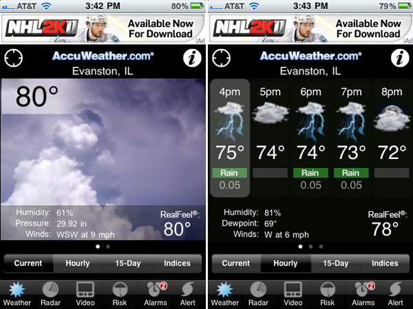
I’ve been through a variety of weather apps for the iPhone. They all do pretty much the same thing, so it’s really just a matter of the small design and interaction elements. For a while I have been using the Accuweather app which has a nice interface, mixing relatively clean graphics and images. I like how the current weather screen shows a photographic image instead of an icon illustrating the current weather.
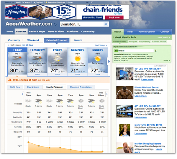
But I had rarely used the actual Accuweather.com website until recently. I thought I would just jump onto the site and check the weather by hour for the afternoon. It was not so easy. On the mobile app, I launch the app and simply click the ‘Hourly’ button (one of four buttons) below the current weather. For a while I was unable to find the hourly forecast. Here is the path I eventually had to follow:
- Locate myself – I know, technically you have to do that on the phone as well, but there are ways of the browser placing me closer to my actual location than New York. Even the ads on the page knew to target Illinois!.
- Click ‘Extended Forecast’ – I’m not sure I agree that the weather in one hour qualifies as an extended forecast.
- Click ‘Hourly Forecast’ in a series of tabs below the 5-day forecast
The challenge of designing for the small screen seems to improve the quality of the interface in many cases. If you can do it with less, why not do it with less? If you can do it more directly, why not do it more directly?


