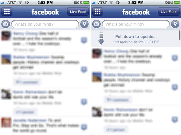
I love it when you get the sense that developers/designers are using and responding to their own products. A few weeks ago, there was a little UI update to the Facebook iPhone app which came across as evidence that some designer or developer at Facebook really, intimately understands how the application is being used – a shocker, I know. It used to be that when viewing the News Feed, you could refresh the feed in one of two ways – by shaking the phone or by pulling the feed down to reveal an ‘update’ button.
While kind of cool, the shake-to-refresh option is a little awkward and doesn’t exactly stem from a natural interaction with the app. It seems more like an angry act of desperation. ‘Why won’t you update?!?!?!’
Pulling to reveal the the ‘update’ button was nice and fit in with some of Apple’s design (pulling a list of email messages down to reveal the search form, for instance). The problem was that this was a two step process which could only have one possible outcome – the update of the feed.
In the Facebook app update, there is no more ‘update’ button when you pull a news feed down past the most recent post in the feed. There are just simple instructions to ‘Pull down to update…’ (not sure what the ellipses indicate…). While only a slight change to the interaction, the adjustment makes so much sense. The way you browse the feed is by dragging the list up or down. So if you pull downward beyond the most recent item, you are effectively looking for content that is more recent, and the new interaction respects this by looking for newer content. In fact, Facebook could even apply this interaction to the ‘Older Posts…’ button at the bottom of the feed (just an idea for all of the Facebook developers who regularly read this blog).

