
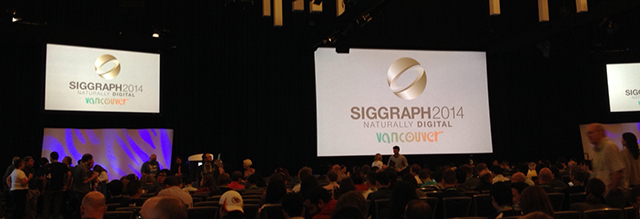
I am delighted to be at this year’s SIGGRAPH Conference in beautiful Vancouver! This is my first time at the International Conference and Exhibition on Computer Graphics and Interactive Techniques and there are an overwhelming number of fascinating presentations, courses, and events to choose from. This five-day conference, which wraps up today, has given me the opportunity to learn about numerous aspects of computer graphics, animation, data visualization, motion control, app development, and technology. Three highlights are described below.
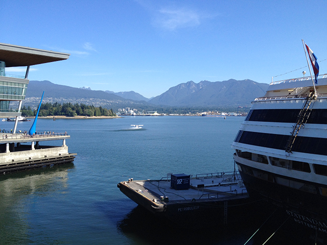
The view from outside the Vancouver Conference Center
Data Visualization, an introduction:
This session discussed the goals/uses for data visualization –
1) as a tool for exploration
2) to analyze the data (explore a hypothesis) and
3) as a presentation/communication method –
gave an overview of two types of data visualization –
1) Scientific visualization – meaning that the data has an inherent geometry, position and often time coordinates (examples: Volume Visualization & Flow Visualization)
2) Information Visualization – meaning that it has no inherent geometry –
and discussed visualization creation as well as challenges to keep in mind when designing your data visualization and areas of ongoing research.
The Glass Class – Designing Wearable Interfaces:
This class focused on head mounted computers, like Google Glass, and covered the evolution of the technology, design considerations for software, as well as challenges for wearable computers. An interesting takeaway is the idea of designing applications for microinteractions, expecting the user to spend very little time with the app before shifting attention away. We were reminded that with wearable devices like Google Glass, the world is the experience, not the device.
Scientific Visualization Sessions (Immersive Visualization for Science & Research; Visualize Collaborate Install):
At these two sessions I heard from people at the National Center for Supercomputing Applications about visualizing astronomical research for large planetarium shows (like at the Adler) and their work to create visualizations true to the research. Ernie Wright from NASA’s Scientific Visualization Center shared his work to recreate the moment when an astronaut aboard Apollo 8 took the famous Earthrise photo and used his visualization to determine when precisely the photo was taken and by whom.
These are just a few of the exciting topics covered this week. I can’t wait to bring the knowledge and inspiration gained here back to A&RT! And in honor of Canada’s two official languages, the international community I had the honor to be a part of this week, and the French computer graphics friends I’ve made here, je finis cette message en français: Bonne soirée de Vancouver et bon courage pour les aventures de demain!

The real-time representation of my hand moving above a motion sensor, during a session on creating 3D interactive apps.