
Edward Tufte was in Chicago this past week, offering up his one-day course “Presenting Data and Information.”
Edward Tufte is widely considered to be an expert in the field of information design and data visualization. Over the course of several hours, he spoke about the many ways in which effective design could drastically improve the rate at which we transfer information to one another.
Effective information transfer. It’s interesting to think about, because that’s really everything we do. Professionally and socially we’re all just trying to communicate as clearly as possible – trying to get as many of the thoughts in “our heads” into “their heads.”
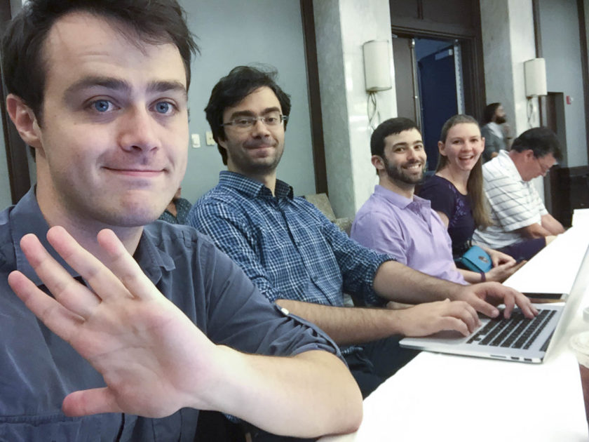
The Northwestern Audience, Awaiting Information Transfer
The course began with a one-hour reading period, or “study-hall” as Tufte called it. This hour of reading and preparation reflects Tufte’s approach to meetings and is directly motivated by his quest for “broadband” information transfer.
The “study-hall” approach to business meetings is pretty interesting. All meetings should start with a data-rich handout. Everyone in the meeting is given time to read and get up to speed on what’s being covered, and once the pre-determined study-hall time is up, the meeting begins as you would expect. Only now, the meeting is able to move faster, contemplate more complicated issues, and transfer more information that before.
Apparently, this method is used all over. Most notably, Jeff Bezos of Amazon.com implemented this study-hall policy for all Amazon meetings.
Throughout the day, Tufte also spoke frequently of ‘High-Resolution’ displays. As a graphic designer, I typically think of ‘High-Resolution’ as it relates to pixel density. “How big does this logo need to be so it’s crisp and clear on a retina screen?” Instead of this pixels-per-inch approach, Tufte spoke about “High-Resolution” as it relates to data-per-inch.
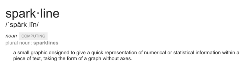
When it comes to data visualization, the goal is to convey as much meaningful information as possible, as quickly as possible. To illustrate this concept of data-rich, high-resolution visualizations, Tufte spoke about something called “Sparklines.”
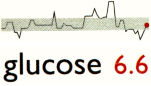 Here’s a great example from Tufte’s book, Beautiful Evidence:
This small graphic might take up only a square inch of real-estate in a book, but it is dense with information. A true high-resolution display.
The graphic shows a patient’s current glucose level in, what Tufte called “A word-number confection.” There, in black, is the thing being measured, and in red; the value. A word-number confection. This doesn’t need to be an overly complicated bar chart or anything like that, just a simple term and value.
Above this word-number confection, is the sparkline. We can see a history of the glucose readings. When the levels peaked above the norm, and when the levels dipped below the norm. The red-dot at the end of the sparkline shows where the current 6.6 falls in comparison.
This simple little sparkline can have hundreds and hundreds of data points packed into it. No, it won’t be the most accurate line graph, but for it’s size, it provides an incredible amount of contextual information. Instead of just one data point, we now have a whole history – a whole new context with which to view the information.
As for the potential inaccuracies? Tufte quoted John Maynard Keynes to say “It is better to be roughly right than precisely wrong.”

One last thing that really interested me during the course was the concept of “Two-Dimensional Sentences.”
Again, everything Tufte spoke about was motivated by efficient transfer of information. To highlight this point, Tufte shared the story of Sheldon Silver, the former New York Assembly Speaker who was arrested and sentenced to 12 years in prison on a corruption charge. Tufte had the room read a New York Times article re-capping the scandal. The article was full of names, numbers, dates, locations – and was just as complex as the web of corruption Sheldon Silver spun.
To break through the confusing onslaught of facts and figures, the New York Times employed the use of a Two-Dimensional sentence – or a simple flow chart – that cut through the clutter and told the story in a clear, efficient way.
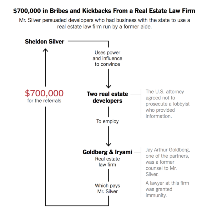
The New York Times
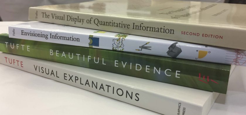
Overall, the course was incredible. I highly encourage everyone to check out Professor Tufte next time he’s in Chicago. In the meantime, I’ve a collection of his books in my office if you wanna flip through some data.