For the past three days, I’ve been out in chilly San Francisco attending Smashing Conference 2018 – a design conference covering a wide array of topics all related to front-end development and elegant interface design.
The conference schedule has been absolutely jam-packed and I’ve been enjoying every minute. To try and recap it all would take me another three days, and I’ve got a flight to catch, so I’ll keep things brief.

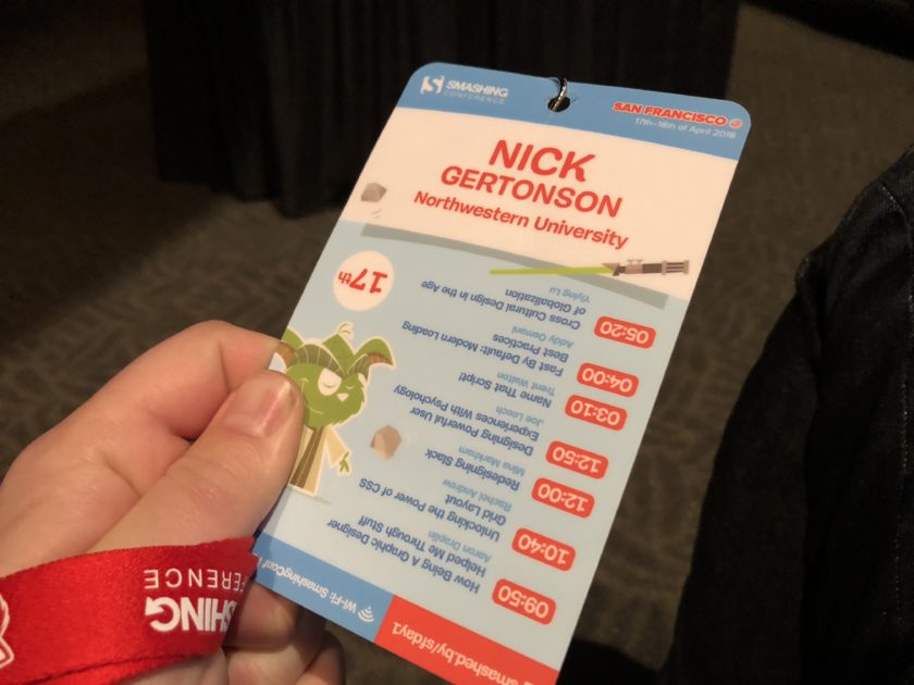
Day 1. You may need to stand on your head to read the schedule…
On Monday, I traveled to the San Francisco State University downtown campus to attend an all day training session on Vue.js, a reactive front-end framework that the Media and Design team has been using for a couple years now. We’ve used Vue to create a number of projects including NUPredicts and the RoomReady reporting tool. Though I’ve had enough of an understanding to contribute code on these design projects, I thought it would be worthwhile to get some hands on training from the ground floor.
The session began, naturally, with a introduction to the basics of Vue – directives, computed properties, methods, and templates – and culminated with some more advanced concepts like mutators and animated page transitions.
I’ve got a ways to go in my Vue-ducation, but I’m left with a more solid understanding of the basics, and a piqued interest in all that Vue has to offer.
One technology that I’m excited about is the ability to build complex and interactive native animations in Vue with libraries like Greensock. As you can see in the below codepen, Greensock allows for complex, interactive SVG animations built natively in Vue.
See the Pen Vue-controlled Wall-E by Sarah Drasner (@sdras) on CodePen.
On Tuesday, I visited the beautiful Palace of Fine Arts where the conference kicked off. Day one saw a number of engaging talks. My favorite was one given by the UX Designer, Joe Leech. Titled Designing Powerful User Experiences With Psychology, Joe spoke about the ways we can improve user experiences and interfaces by leveraging what we know about human psychology.

Here’s a picture of the palace grounds.

Here’s a picture of me on the palace grounds.
One takeaway from this talk was the concept of Hick’s Law. To paraphrase, Hick’s law states that users take longer to make decisions when they’re confronted with more options. This may seem like common sense, but it’s interesting when you consider that when surveyed, users tend to claim to want more options!
I mean, it makes sense. If I was trying to buy shoes, I’d probably want to choose from tons and tons of options. When I go to buy those shoes, though, it’ll take me longer and longer to find the ideal pair when more options are introduced.
When conversation rates are used as a metric of success on your website or app, it’s always good to keep your options to a minimum.
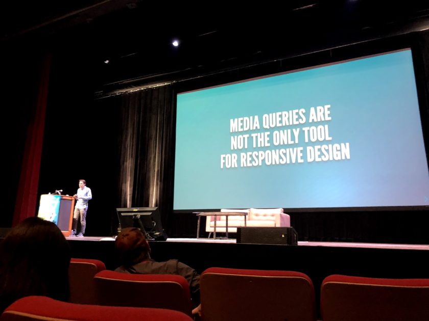
On Wednesday, I returned to the Palace for the final day of the conference where I caught an awesome talk on the future of responsive design. In Beyond Media Queries, the Australian web developer, Michael Riethmuller reviewed some best practices for modern responsive design.

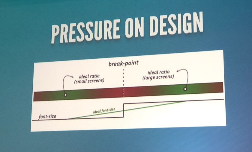
For a while now, breakpoints have been used to reshape a site’s layout based on the size and resolution of the device being used to view it. These breakpoints are typically declared using media queries that essentially say, “Okay, when the browser width is less than 700px, the site should switch to a one column layout.”
This approach causes what Riethmuller calls “pressure points” for the site design. A responsive site might look amazing on the large screen of a laptop, and might use breakpoints to reformat on a mobile device, but pressure points occur in between these two ideals.

I’m excited to lessen my reliance on media queries. As browsers continue to evolve, so too do the standards we use to craft our responsive websites. Newer techniques like flexbox, viewport units, and calc functions allow for greater control of a site’s design, without having to create special overrides for dozens and dozens of screen sizes.
There’s tons more that I could write about here, but that’s all I’ll say for now. Should you want to know more about modern loading best practices, the blight of third-party scripts, our relationship with digital interfaces, or all the cool conference swag I came away with, feel free to drop me a line. I’d be happy to share more about my experience at Smashing Conference 2018.

