The Sneaky Browser
The browser is a sneaky thing. We think of the browser as a single window to an open sea of information that is the World Wide Web. But the browser has, over time, actually become an opening to two distinct oceans – one that supports information gathering and and one that supports task completion. On the information gathering side, things are more or less what they have been from the very beginning of the interwebs. People push information out and others consume it in a (potential) one-to-many model. The browser allows us to handle all of that information, both as producers and consumers.
But then the browser began to sneak its way into another, very different mode of operation. It began offering an experience so rich that the obvious next step was to use the browser as a portal through which we do stuff. The browser stayed the same. But the object upon which it was acting began to morph from information to application. The browser was now taking us to the web application.
This new role for the browser was logical and welcomed, of course. But there is a problem. When I jump from reading the New York Times to checking off to-do items in Basecamp, I do so transparently, and because I am so accustomed to it now, it all just falls under the category of ‘The Web’.
A Window and a Light Switch
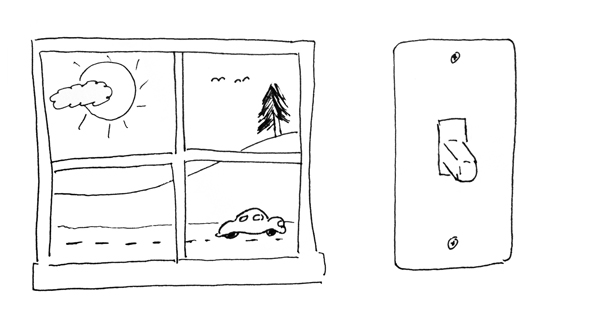
Yet, the tools necessary for browsing/consuming information and the tools needed to move a specific task to completion are very different. Imagine a small, simple room. In that room are two things:

A window and a light switch. You would go to each of these for different reasons. A window is useful for information gathering. From a view out the window you might ascertain roughly the time of day, some idea of the weather, and a little information about your immediate environment. The structure of the window is extremely simple – at it’s most basic, a window is really just a hole in the wall – but the number of visual cues can be extremely high.
By contrast, the light switch is great for task completion. Just flip it. But it is very shallow in information reporting. It basically offers a ‘yes’ or ‘no’, and the visual cues are very low. And while the structure of the system which it represents – electrical wiring, light fixtures, etc. – is fairly complex, the simplicity of the switch is what gives it such power. There are no instructions needed for a basic light switch because its design reflects only the necessary steps to complete the defined tasks.
Obviously, we’re talking about information gathering interfaces (the window) and task completion interfaces (the light switch) and while there is often some overlap between the two, they are and should be different. To feed visitors information, you are opening up the possibilities. You are giving them paths to explore, perhaps offering guidance along the way in terms of navigation structure or suggested related material. But the inherent concept is that you want to provide methods of access to all of the content you are providing.
Conversely, to help users do something, you are narrowing the possibilities. Applications help us achieve results more efficiently than we would otherwise by reducing choices to those that actually have meaning in the context of the task, so directing and narrowing the possibilities is key. So the window and light switch are at odds.
The first step is to identify what the web site, page, or action is meant to do. Does it feed or does it do? Most sites will have both modes of operation. In general the New York Times site feeds, but occasionally one needs to complete a task such as finding a specific article, emailing a piece, or signing up for home delivery of the print edition. Those are all tasks within the larger system, and should be designed according to the light switch model not according to the window model. Of course, keeping the task painless and straight-forward is especially important when you’re asking the visitor to complete the task in the midst of reading an article.
Here are a few basic questions:
- What is the site meant to achieve? Feed or do?
- What is this page meant to achieve? Feed or do?
- What is this individual action meant to achieve? Feed or do?
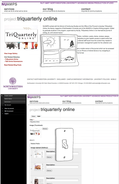
This topic has been on my mind lately because when developing content management system based sites (which we do a lot), we deal in designing both of these interfaces to act upon the same data – the information distribution/consumption interface for site visitors and a task completion interface for content managers.

We are pretty good at building the window, but we can always improve (or streamline) our light switches. In a few upcoming projects we are going to be doing our best to tackle this issue. I’ll try to offer my thoughts on the experience as we do.
